데이터분석 하면 가장 기초가 되는 타이타닉 데이터
학부생 때 했던 기억이 새록새록 난다.
다시 한번 공부하고 정리하는 포스팅을 할려고 한다.
타이타닉의 주요 데이터 컬럼은 아래와 같다
- Survived : 생존 여부 (0 = 사망, 1 = 생존)
- Pclass : 티켓 클래스 (1 = 1등석, 2 = 2등석, 3 = 3등석)
- Sex : 성별
- Age : 나이
- SibSp : 함께 탑승한 자녀 / 배우자 의 수
- Parch : 함께 탑승한 부모님 / 아이들 의 수
- Ticket : 티켓 번호
- Fare : 탑승 요금
- Cabin : 수하물 번호
- Boat : 탈출한 보트가 있다면 boat 번호
- Embarked : 선착장 (C = Cherbourg, Q = Queenstown, S = Southampton)
1. 가설 설정 및 분석 계획
- 분석 질문
생존 확률에 영향을 주는 요인은 무엇인가?>
- 가설
1. 여성은 남성보다 생존율이 높을 것이다.
2. 1등석 승객일수록 생존율이 높을 것이다.
3. 20세 이하 승객의 생존율이 50대 이상 생존율 보다 높을 것이다.
import pandas as pd
import seaborn as sns
import matplotlib.pyplot as plt
import matplotlib

df = pd.read_csv("train.csv")

df.info()
df.isnull().sum()
필요한 라이브러리를 가져와주고, 결측치를 확인하였다.
결측치 있는 컬럼은 Age, Cabin, Embarkede
PassengerId      0
Survived         0
Pclass           0
Name             0
Sex              0
Age            177
SibSp            0
Parch            0
Ticket           0
Fare             0
Cabin          687
Embarked         2
dtype: int64
나이의 결측값을 채워넣어주기로 하였다.
크로스탭으로 확인하면 호칭이 정리되어 있다.
호칭에 따른 나이대를 임의로 분류하기 시작
df['Title'] = df['Name'].str.extract(r',\s*([^\.]+)\.', expand=False)

pd.crosstab(df.Title,df.Sex).T.style.background_gradient(cmap='summer_r')
df.groupby('Title')['Age'].mean()

df['Title'].replace(['Capt','Col','Don','Dr','Jonkheer','Lady','Major','Mlle','Mme','Rev','Sir','the Countess'],['Other','Other','Mr','Mr','Mr','Mrs','Mr','Miss','Mrs','Mr','Mr','Mrs'], inplace=True)
df.groupby('Title')['Age'].mean()Title
Master 4.574167
Miss 21.804054
Mr 32.813253
Mrs 35.873874
Ms 28.000000
Other 62.000000
Name: Age, dtype: float64
나이가 비워져있으면서 호칭별로 평균 나이대를 넣어주었다.
# null 값에 위 데이터 평균값을 넣어준 뒤 null 값이 있는지 확인한다.

df.loc[(df.Age.isnull()) & (df.Title == 'Mr'), 'Age'] = 33
df.loc[(df.Age.isnull()) & (df.Title == 'Mrs'), 'Age'] = 36
df.loc[(df.Age.isnull()) & (df.Title == 'Miss'), 'Age'] = 22
df.loc[(df.Age.isnull()) & (df.Title == 'Master'), 'Age'] = 5
df.loc[(df.Age.isnull()) & (df.Title == 'Other'), 'Age'] = 62
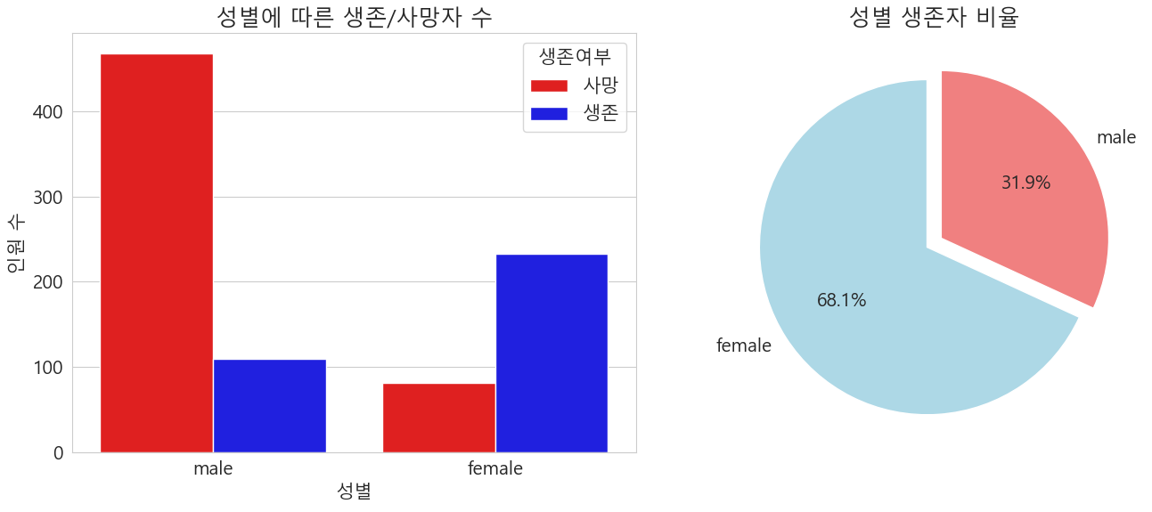
성별 생존율 및 생존자 수
gender_survived = df[df['Survived'] == 1]['Sex'].value_counts()

fig, ax = plt.subplots(1, 2, figsize=(14, 6))

# 1. 성별 생존/사망자 수 - countplot
sns.countplot(data=df, x='Sex', hue='Survived', palette={0:'red', 1:'blue'}, ax=ax[0])
ax[0].set_title('성별에 따른 생존/사망자 수')
ax[0].set_xlabel('성별')
ax[0].set_ylabel('인원 수')
ax[0].legend(title='생존여부', labels=['사망', '생존'])

# 2. 성별 생존률 - pie 차트
colors = ['lightblue','lightcoral']
ax[1].pie(
    gender_survived,
    labels=gender_survived.index,
    autopct='%.1f%%',
    startangle=90,
    colors=colors,
    explode=[0.05,0.05]
)
ax[1].set_title('성별 생존자 비율')

plt.tight_layout()
plt.show()
남성이 여성보다 생존율 자체가 낮았고, 성별에 따른 생존자 비율은 약 7:3 비율로 여성이 생존율이 높았다.
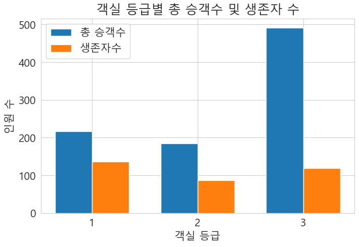
객실 등급에 따른 생존
# 객실 등급에 따른 생존자 수 확인

total_counts= df['Pclass'].value_counts().sort_index()

survived_counts = df[df['Survived'] == 1]['Pclass'].value_counts().sort_index()

classes = total_counts.index.astype(str)
x = np.arange(len(classes))
width = 0.35

fig,ax = plt.subplots(figsize=(8,5))
# 총승객수
r1 = ax.bar(x- width/2, total_counts, width, label='총 승객수')
#생존자수
r2 = ax.bar(x + width/2, survived_counts, width, label='생존자수')

ax.set_xlabel('객실 등급')
ax.set_ylabel('인원 수')
ax.set_title('객실 등급별 총 승객수 및 생존자 수')
ax.set_xticks(x)
ax.set_xticklabels(classes)
ax.legend()

plt.show()
육안으로 봐도 3 등급의 생존자율이 매우 낮았다.
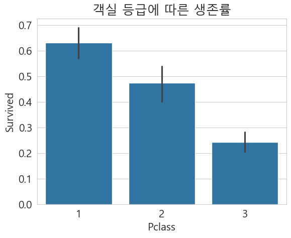
# 객실 등급에 따른 생존률
sns.barplot(data=df, x='Pclass', y='Survived')
plt.title('객실 등급에 따른 생존률')
plt.show()


#객실 등급별로 성별에 따른 생존률
sns.barplot(data=df, x='Pclass', y='Survived', hue='Sex')
plt.title('객실 등급별 성별 생존률')
plt.ylim(0,1)
plt.show()
생존율로 보게 된다면 1 등급이 가장 높았고 가장 낮은 3등급
성별 생존율을 봤을 때 1등급의 남자들의 생존율이 2,3등급에 비해 30%가 넘는점을 확인 할 수 있다.

연령대별 생존율
# 연령대별 생존률

fig, ax = plt.subplots(1,2 , figsize=(20,5))
df[df['Survived']==0].Age.plot.hist(ax=ax[0],bins=10,edgecolor='black',color='red')
ax[0].set_title('생존 하지 못한 사람')
x1=list(range(0,85,10))
ax[0].set_xticks(x1)

df[df['Survived']==1].Age.plot.hist(ax=ax[1],color='green',bins=20,edgecolor='black')
ax[1].set_title('생존 한 사람')
x2=list(range(0,85,10))
ax[1].set_xticks(x2)
plt.show()
20~30대 연령대에 사망수가 압도적으로 많았다.
0~10세 어린이에서 높은 생존율을 보였다.

객실 등급별, 성별, 나이 분포에 따른 생존율
g = sns.FacetGrid(df, row='Pclass', col='Sex', hue='Survived', height = 4, aspect=1.2, palette='Set1', legend_out=True)
for ax in g.axes.flatten():
    ax.set_xticks(range(0, 91, 10))
    ax.set_xticklabels([str(i) for i in range(0, 91, 10)])
g.map(sns.kdeplot, 'Age', fill=True, alpha = 0.5)

g.set_axis_labels('나이','밀도')
g.set_titles(row_template='객실 등급 : {row_name}' , col_template="성별 : {col_name}")

g.add_legend(title="생존 여부", labels=['사망(0)','생존(1)'])

plt.suptitle('객실 등급별, 성별 나이 분포에 따른 생존율')
plt.tight_layout(rect=[0, 0.03, 1, 0.98])
plt.show()
1,2 등실의 여성과 아이들의 생존율이 높았다
그 다음은 1등석의 성인 남자가 높았다.
2,3등실 성인 남자의 생존율이 매우 낮은걸 볼 수 있다.

요약
1, 여성은 남성보다 생존율이 높았다.
2. 1등석 승객의 생존율이 가장 높았다.
3. 20세 이하 승객의 생존율이 50세 이상보다 높았다.
'데이터분석' 카테고리의 다른 글
| 리텐션이란? (0) | 2025.10.13 |
|---|---|
| QGIS 간단하게 사용하기 , 위도경도, 폴리곤데이터 시각화하기 (3) | 2025.08.15 |
| 2. 막힘없는 데이터 분석을 위한 솔루션 (1) | 2025.07.17 |
| 1 . 데이터 분석 프로젝트 3단계 (1) | 2025.07.16 |
